
Getting more from your data.
Everyone wants data from buildings these days. Most people don’t want to spend all day (or even an afternoon) trying to make sense of it.
With that in mind we built the Purrmetrix account to provide tools for quickly making sense of your environmental data and processes to automate the results. Tools in account can be used to produce simple performance metrics, or they can help visualise data for a deeper dive into a building’s performance to understand where things might be going wrong.
With our account overhaul nearly complete, now seems like a good time to revisit some of the most popular tools and give some real world examples of how they can be used.
Building Performance Metrics
Heat loss – measuring HTC for retrofit
A lot of our work at Purrmetrix is digesting a lot of data to deliver single figures of performance. We looked at condensation risk and ventilation rate in our last blog post – another very important attribute for building performance is heat loss, and we deliver HTC SMETER calculations for housing, with our partners City Science and Build Test Solutions. In situ heat loss testing is extremely helpful to cut through the confusion when trying to manage retrofit projects: it helps identify the right homes for funding and improvements and validate that these projects are successful.
An accurate heat loss figure is the critical building block for determining the heating thermal energy requirement (kWh/m3). It helps refine EPC and archetype data to better understand the real world performance of homes and to inform design decisions. We use smart or conventional meter reads combined with temperature data to deliver HTC reports for each home. This is a delivered as a standalone report at present, with plans to deliver HTC in account in future versions.
Goldilocks – a universal building performance benchmark
For benchmarking performance, Goldilocks sets the targets for performance and then tells you how much time has been spent in compliance. It’s a handy way to compare large numbers of buildings or to compare performance across time.
There are lots of uses, depending on the environmental metric you are using. For example in housing it can be to compare homes to see which homes are persistently cold, identifying possible fuel poverty issues.
It can also be used as a rough guide to homes at risk of condensation issues. In offices or schools it can be used to compare CO2 in meeting rooms or classrooms to show where extra ventilation is needed.
While we’re talking about general tools, there are also views to calculate comfort metrics, averages and max min for any data stream. These are most typically used when benchmarking performance and comparing it over time, before and after improvements to a space.
Visualisations – making sense of building complexity
Sometimes it’s important for technical specialists to get deeper into the data and see what clues it can give about problems in buildings. For these situations, visualisations can be incredibly powerful, making it easier to digest and make sense of a lot of data. Graphing and bar charts are a standard way of visualising data, and we provide these, but other views go deeper:
Heatmap
Our heat map tool allows the data to be accurately positioned on a building plan and replayed to examine the behaviour over time – can you see solar gain moving around an office building? Is high humidity in the kitchen also affecting the living room?
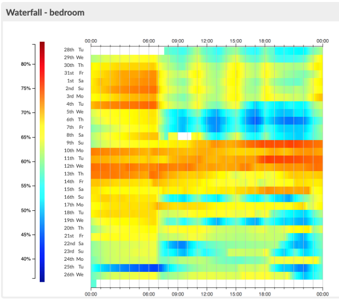
Waterfall
Each line of a waterfall visualisation heat maps a metric across a complete day. This is a fantastic visualisation for spotting recurring patterns of behaviour; whether it is identifying if heating systems are turning on and off at the right time, or finding a damp problem that is related to external rain events.
Reporting and alerts
All of these tools can be wrapped up in our reporting function, which delivers reports via email on a regular cycle. Of course we also have live data, so if there are situations where a timely response is important then our alerting tools can be used to deliver a call to action. We’ll look at how to use these tools in more detail in a future blog, or you can visit our support section now.